Unifying an eCommerce site & sales tool for Georgia-Pacific
Skills
Visual Design
UI Design
Medium
eCom Website
Webapp

GP PRO
A seamless eCommerce experience paired with a new proposal tool to optimize their sales process
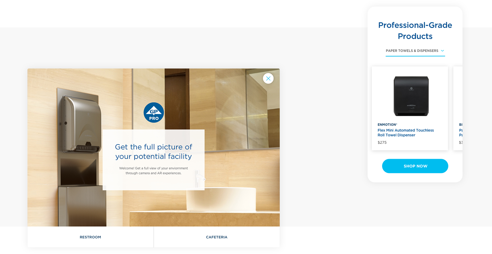
Originally, GP Pro, a subsidiary brand of Georgia-Pacific, separated their marketing content from their online catalog. The challenge was to merge this disparate content into one seamless experience. Each page prioritized products first, for quick access to browsing and featured marketing content below for users looking to learn more about their dispensers.
To create a cohesive design system for GP to further build upon, I created content specific components to provide GP with a template structure and the guidance on how to construct future pages. Visually, I utilized GP’s branding as a base, while improving typography hierarchy through size and treatment variation for both readability and aesthetic appeal. I worked on the user interface and visual design alongside a UX designer and researcher.
Solution Builder
To expedite GP’s sales process, I created a tool that allows
GP sales employees to intake a customer’s business profile and current products, in order to populate a suggested solution. Individual customers are also able to use this tool on their own. The different experience levels of both sales employees and customers informed the user’s path. I collaborated with two UX designers to create the user journey map and wireframes, while personally leading the visual design. The aesthetic established in the eCommerce website carried over to create a cohesive brand experience.

TASK 1
Exploring industry insights
The first part of the tool asks for required client information, while providing helpful insights during the process. GP Pro staff are able to access a menu while using the tool with the client and later at their office. The individual customer on the other hand, doesn’t have access to the menu to stimulate a linear experience.
TASK 2
Defining a user’s current state
In order to provide suggested products, clients with or without guidance from a GP employee are prompted to enter what current products they have at their facility. This stage allows them to define all applicable usage areas and products with the option to add photos of their facility.
TASK 3
Creating a solution
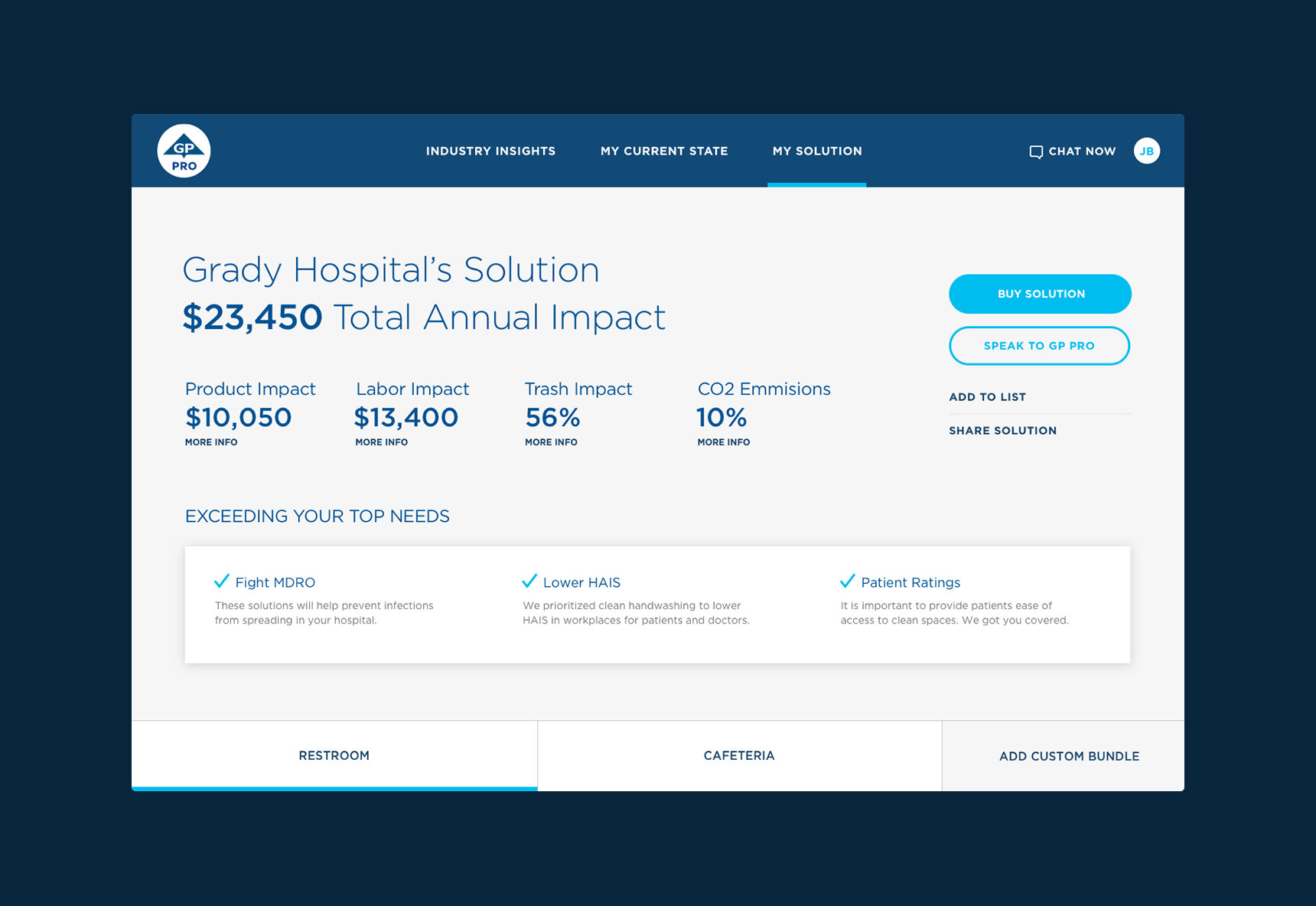
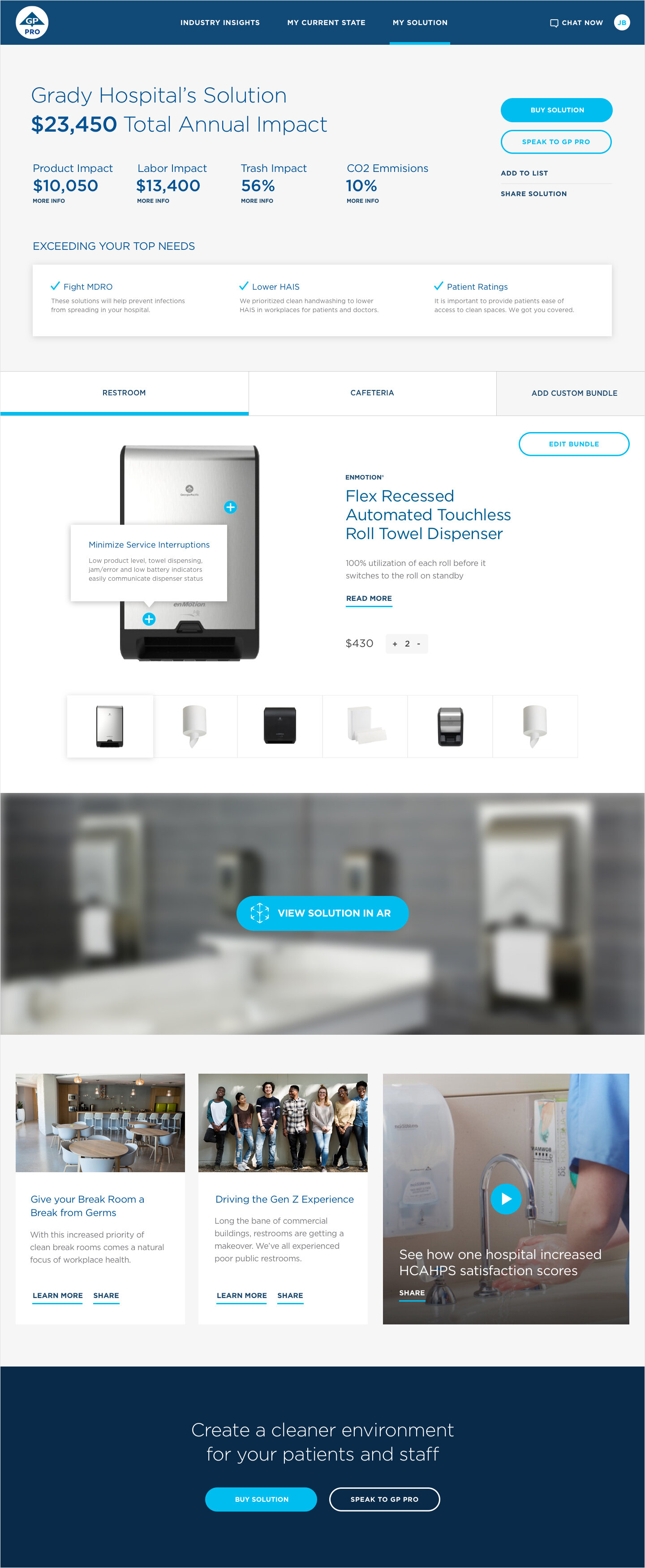
Once all necessary information has been added, a client is able to see GP’s proposed solution including savings, needs met and suggested products. All users have the option to add these products to their environment using augmented reality.

TASK 3
Option for users to utilize augmented reality
Users are able to add products from their suggested collection into their environment using an augmented reality application. Once a product is added, users can explore product features and 3D animations. This tool also allows users to edit their bundle and save images of the augmented reality configurations.
DOCUMENTATION
Clarifying the steps for each user
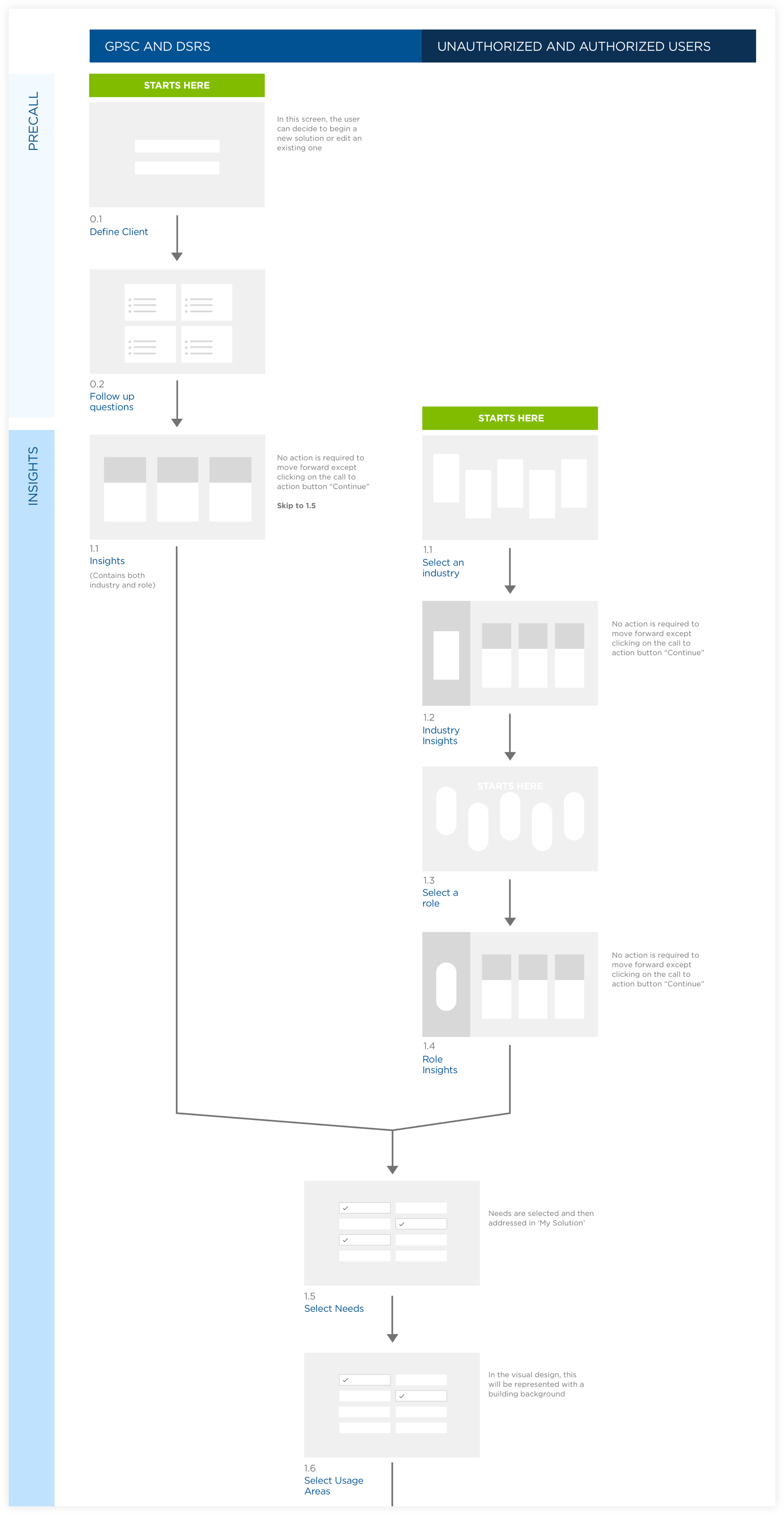
I created a user flow diagram in a brainstorm session with UX Designers. I designed the visual document to translate to both GP and the developers what each step entailed for all three user groups. Featured below is the first set of tasks for the solution builder web application.

Let’s
collaborate
LINKEDIN