Demonstrating the youthful lifestyle of a water sports brand
Skills
Visual Design
Interaction Design
Medium
eCom Website

RADAR SKIS
Radar Skis is a water ski company dedicated to advancing the sport.
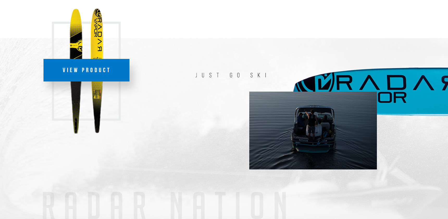
The redesign established a fresh look through large typography, high contrast via alternating black and white accents, movement through size variation and overlapping elements. This creates an aesthetic that is both energetic and modern, appealing to a target audience from teenagers to middle aged men.
— Awarded the Ava Digital Platinum Award, 2019
View Site

ECOMMERCE
Including both technical details and dynamic imagery
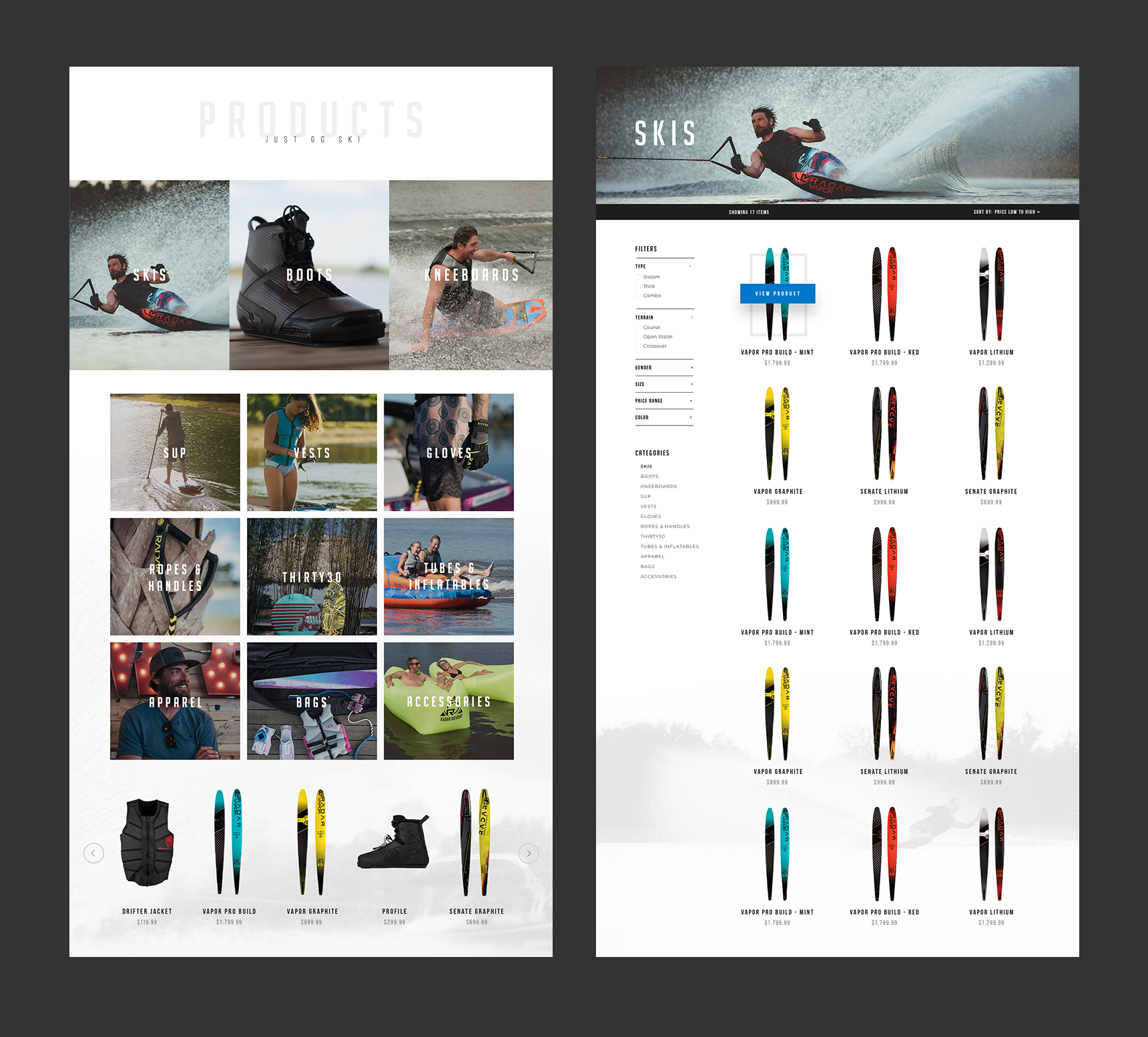
Each product page includes information on the technical specifications and a graphic showcasing the ski’s attributes. The combination of full width imagery and videos demonstrate how the products perform. Though waterskis are the feature product, Radar also sells other water sport gear and accessories; therefore a hierarchy was implemented on the product overview page.


COLLECTIONS
All the gear you need
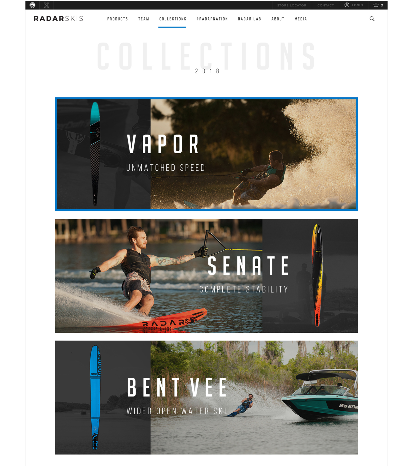
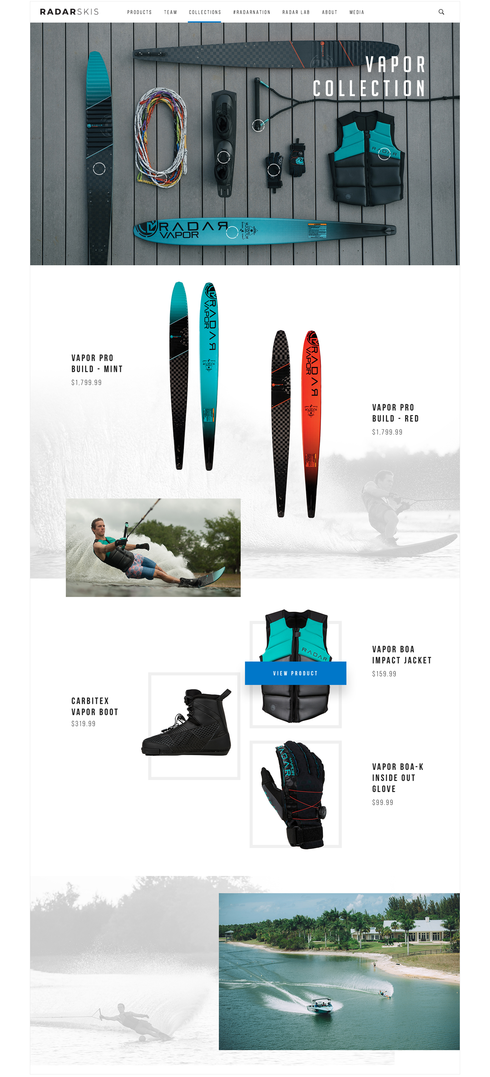
Discovering products through curated collections allows customers to explore and purchase a cohesive set of gear. To create a fluid shopping experience, I designed these pages with an approach similar to a look book. The overview page ties each collection with a sponsored athlete, while the description defines the collections theme.


ABOUT
Just go ski
Featuring Radar’s team of athletes gives credibility to their dedication to the sport and product performance. Each profile includes a small bio and a collage of images of the athlete using the company’s products. The about and media page further utilize imagery in varying to lead the customer’s eye down the page. These pages serve to connect customers with the brand’s history of innovation and get involved with their current events.


Let’s
collaborate
LINKEDIN