Streamling offer & educational emails for Google Fi users
Skills
Visual Design
CRM Design
Medium
Email Newsletters

GOOGLE FI WIRELESS
Intentional campaign emails centered around data and engagement
Developing year-round email campaigns utilizing a CRM system for Google Fi Wireless, a telecommunications service provided by Google. I collaborated closely with a creative and copywriting team to design engaging email communications for seasonal promotions and educational content.
To reduce customer churn, we reassessed the onboarding strategy based on current statistics and user demographics. This involved breaking down three comprehensive emails into six targeted, concise messages delivered at various touchpoints, focusing on key features most relevant to users. Following Google Fi’s rebranding, we integrated abstract shapes, a bold color palette, and lifestyle photography tailored to family audiences.
Additionally, we designed campaigns highlighting mobile offers centered around the latest Pixel devices, aligning with the seasonal aesthetics to enhance engagement.


Showcasing a CX platform as an enterprise solution
Skills
Visual Design
Medium
Product Website
GET FEEDBACK
Highlighting the key purposes and benefits of a CX platform
Get Feedback, a subsidary of Survey Monkey, aimined to reposition the brand as a solution for larger companies. Working with a team of designers, we centered the key components of the platform with intentional imagery, while educating users on how collecting feedback improves their business. Stylistically, we utilized Get Feedback’s bold green and abstract elements to nod to the company’s cutting edge, ever evolving technology that moves with the speed of customers. Personally, I was responsible for designing pages and assets across the site, as well as communicating with the development team for a smooth site launch.
View Site
IMAGERY
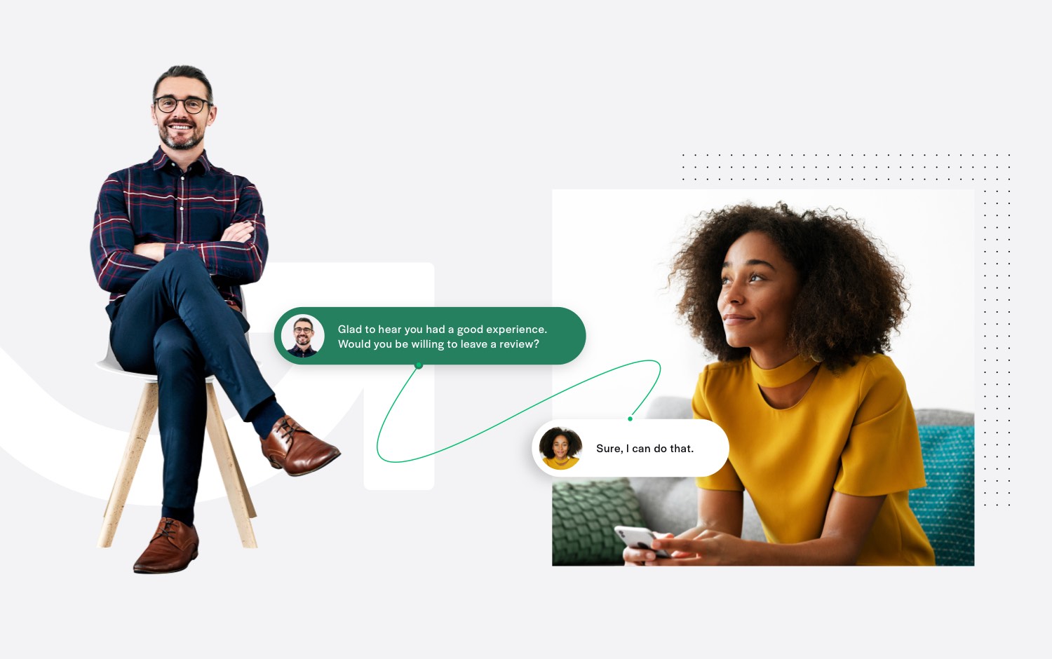
Humanizing the customer experience
Throughout the site, large isolated imagery of CX experts interacting with customers demonstrated both the efficiency and quick response time made possible with Get Feedback.
FEATURES
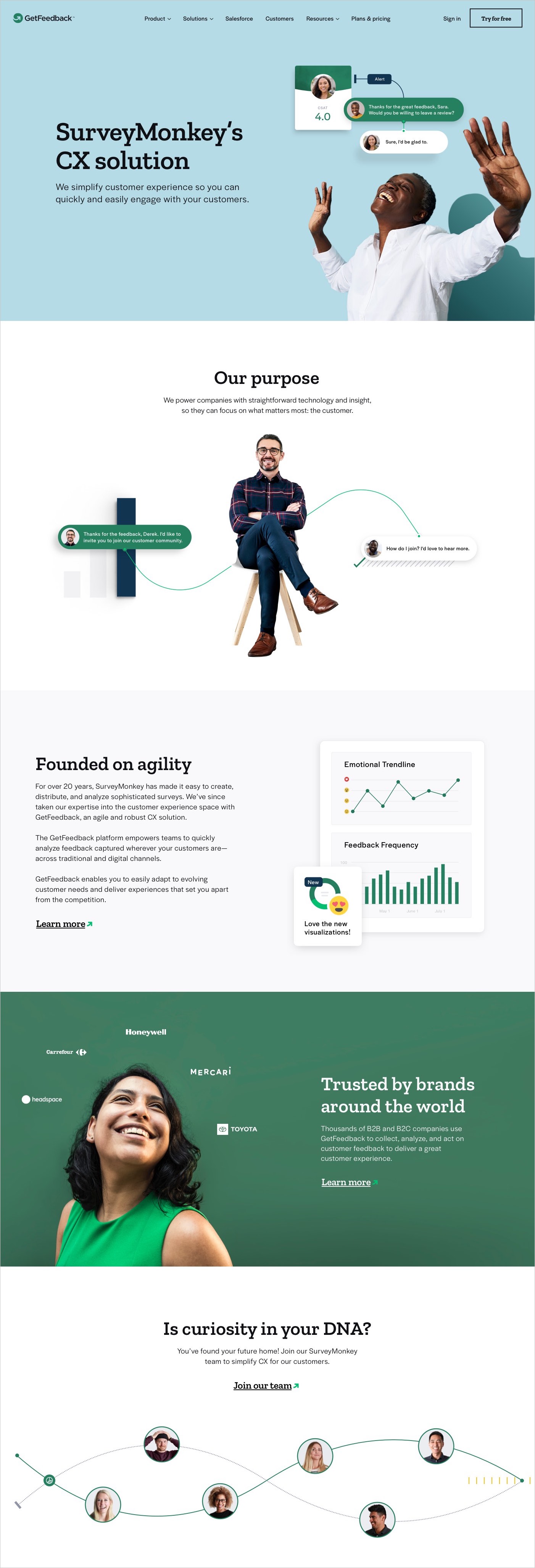
Using dynamic product UI elements to highlight key features
On product pages, we focused on specific feedback, customer interactions, and insights that Get Feedback offers to small and large businesses. With the use of abstract elements and patterns, the imagery both showcases the product, while still expressing the future-forward brand. Testimonials are also featured throughout the site to provide both context and credibility to the tool.


EDUCATION
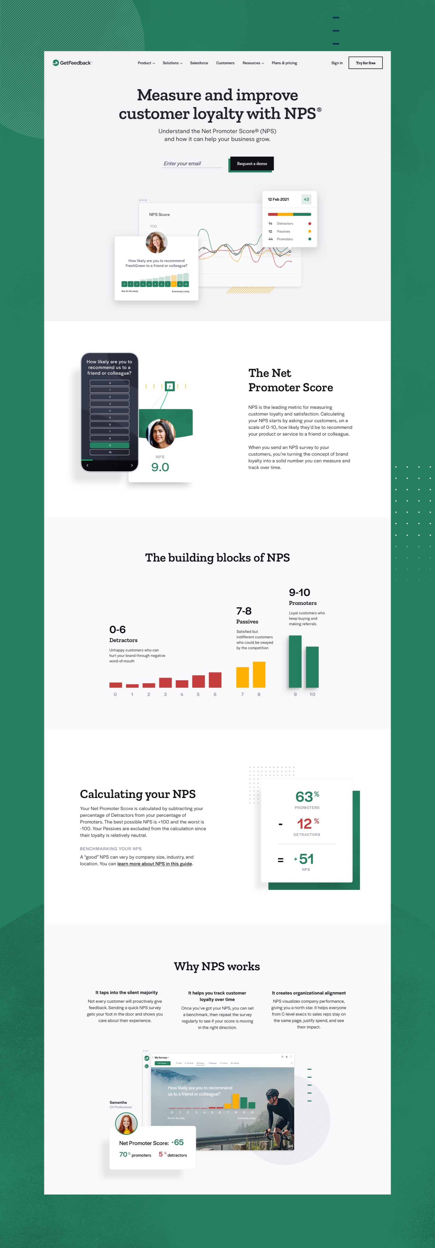
Informing businesses on CX terminology
To provide further context, specific pages were dedicated to walking businesses through the various types of feedback potential or current clients can collect with Get Feedback as well as their purpose. Clear content and dedicated graphics were designed to walk users through new material in a straightforward manner.
Unifying an eCommerce site & sales tool for Georgia-Pacific
Skills
Visual Design
UI Design
Medium
eCom Website
Webapp
GP PRO
A seamless eCommerce experience paired with a new proposal tool to optimize their sales process
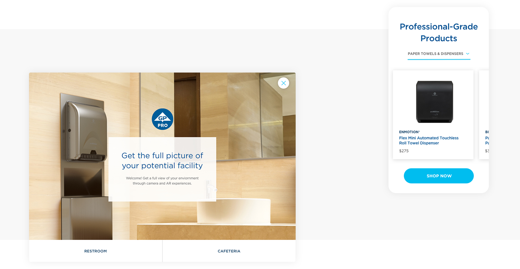
Originally, GP Pro, a subsidiary brand of Georgia-Pacific, separated their marketing content from their online catalog. The challenge was to merge this disparate content into one seamless experience. Each page prioritized products first, for quick access to browsing and featured marketing content below for users looking to learn more about their dispensers.
To create a cohesive design system for GP to further build upon, I created content specific components to provide GP with a template structure and the guidance on how to construct future pages. Visually, I utilized GP’s branding as a base, while improving typography hierarchy through size and treatment variation for both readability and aesthetic appeal. I worked on the user interface and visual design alongside a UX designer and researcher.
Solution Builder
To expedite GP’s sales process, I created a tool that allows
GP sales employees to intake a customer’s business profile and current products, in order to populate a suggested solution. Individual customers are also able to use this tool on their own. The different experience levels of both sales employees and customers informed the user’s path. I collaborated with two UX designers to create the user journey map and wireframes, while personally leading the visual design. The aesthetic established in the eCommerce website carried over to create a cohesive brand experience.
TASK 1
Exploring industry insights
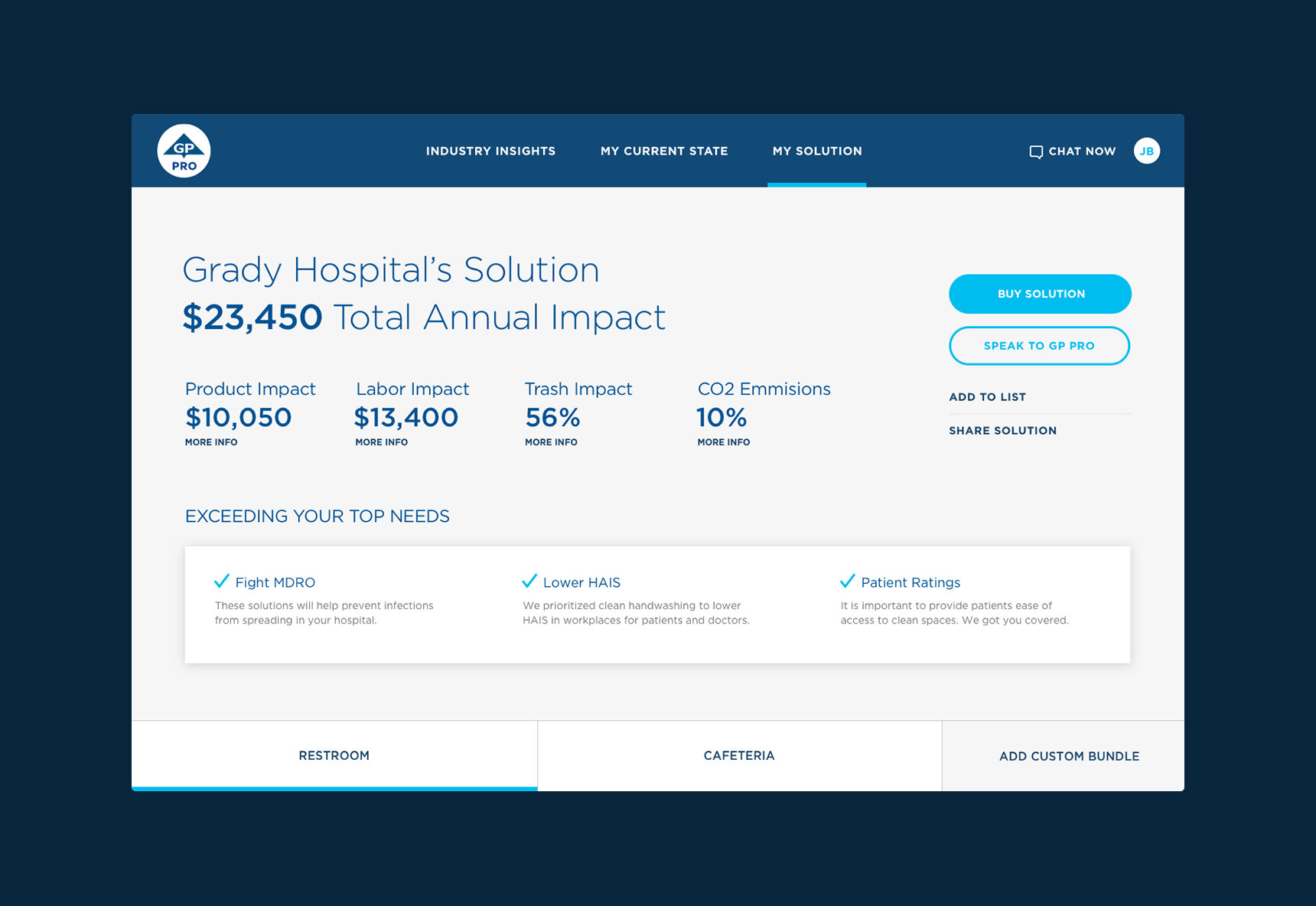
The first part of the tool asks for required client information, while providing helpful insights during the process. GP Pro staff are able to access a menu while using the tool with the client and later at their office. The individual customer on the other hand, doesn’t have access to the menu to stimulate a linear experience.
TASK 2
Defining a user’s current state
In order to provide suggested products, clients with or without guidance from a GP employee are prompted to enter what current products they have at their facility. This stage allows them to define all applicable usage areas and products with the option to add photos of their facility.
TASK 3
Creating a solution
Once all necessary information has been added, a client is able to see GP’s proposed solution including savings, needs met and suggested products. All users have the option to add these products to their environment using augmented reality.
TASK 3
Option for users to utilize augmented reality
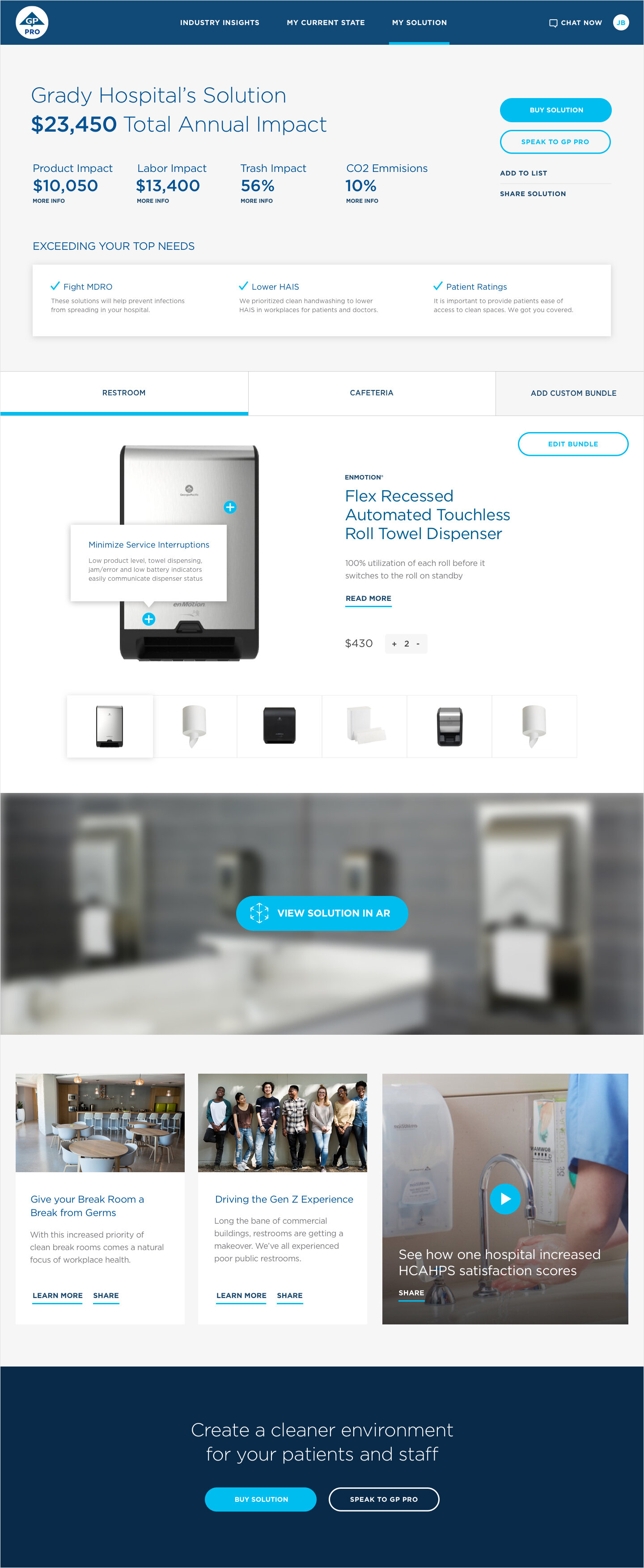
Users are able to add products from their suggested collection into their environment using an augmented reality application. Once a product is added, users can explore product features and 3D animations. This tool also allows users to edit their bundle and save images of the augmented reality configurations.
DOCUMENTATION
Clarifying the steps for each user
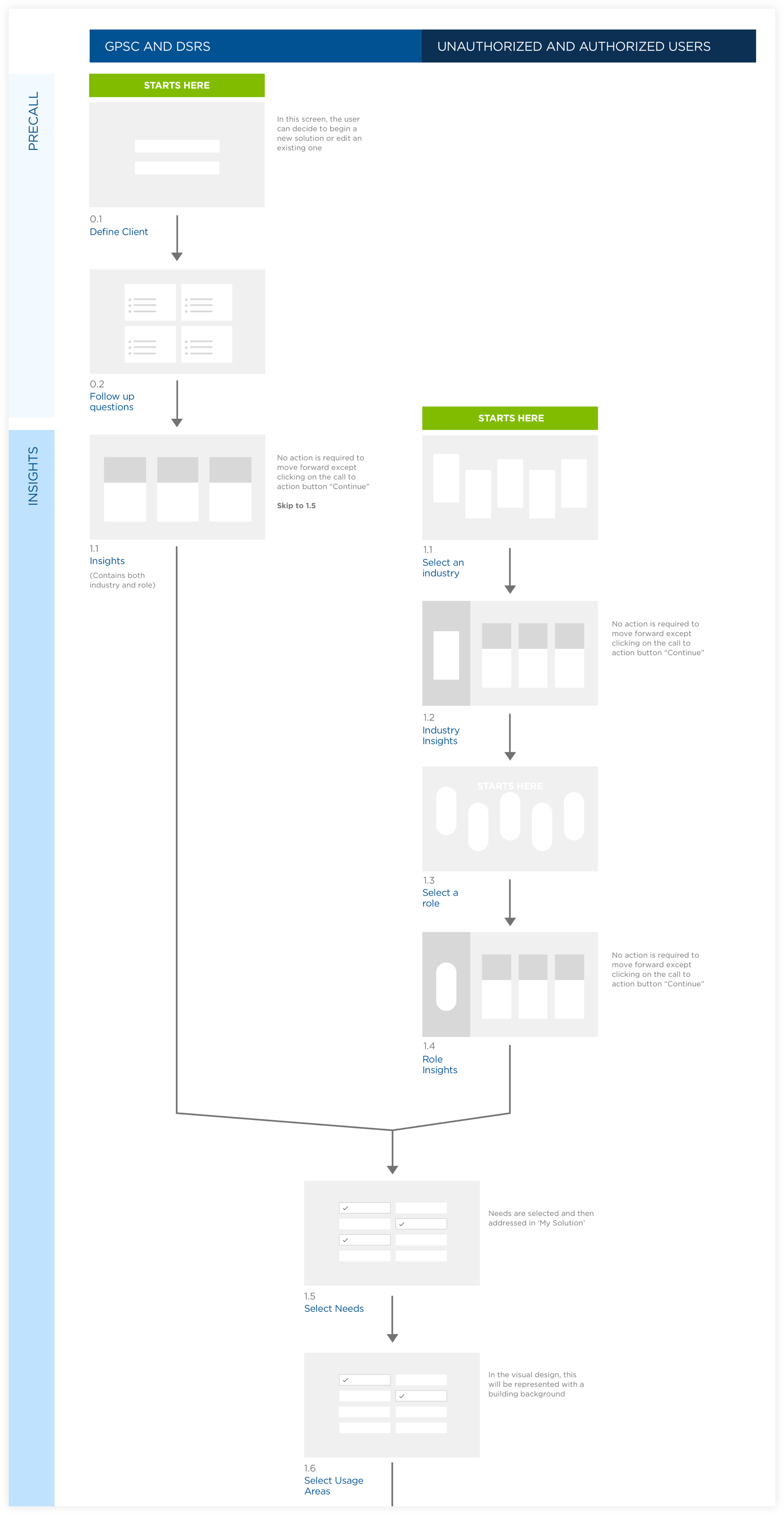
I created a user flow diagram in a brainstorm session with UX Designers. I designed the visual document to translate to both GP and the developers what each step entailed for all three user groups. Featured below is the first set of tasks for the solution builder web application.
Demonstrating the youthful lifestyle of a water sports brand
Skills
Visual Design
Interaction Design
Medium
eCom Website
RADAR SKIS
Radar Skis is a water ski company dedicated to advancing the sport.
The redesign established a fresh look through large typography, high contrast via alternating black and white accents, movement through size variation and overlapping elements. This creates an aesthetic that is both energetic and modern, appealing to a target audience from teenagers to middle aged men.
— Awarded the Ava Digital Platinum Award, 2019
View Site

ECOMMERCE
Including both technical details and dynamic imagery
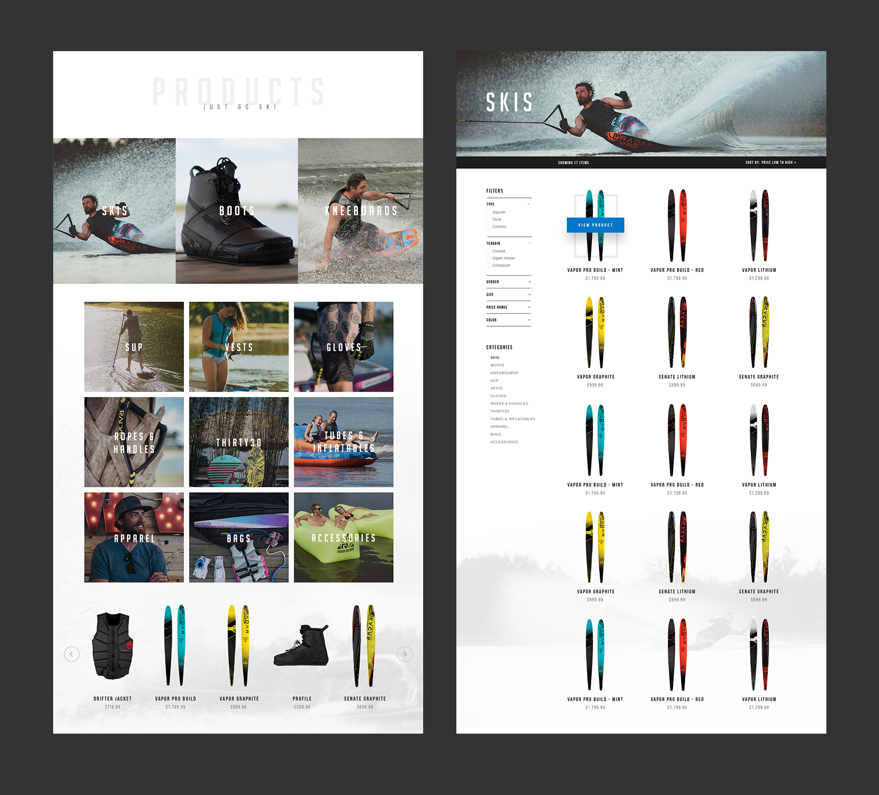
Each product page includes information on the technical specifications and a graphic showcasing the ski’s attributes. The combination of full width imagery and videos demonstrate how the products perform. Though waterskis are the feature product, Radar also sells other water sport gear and accessories; therefore a hierarchy was implemented on the product overview page.

COLLECTIONS
All the gear you need
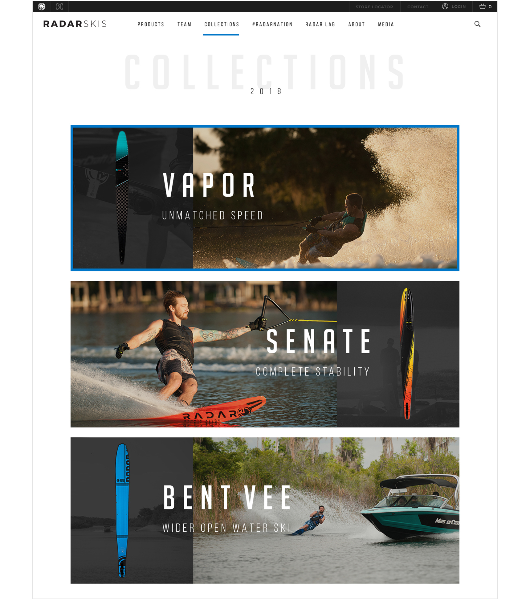
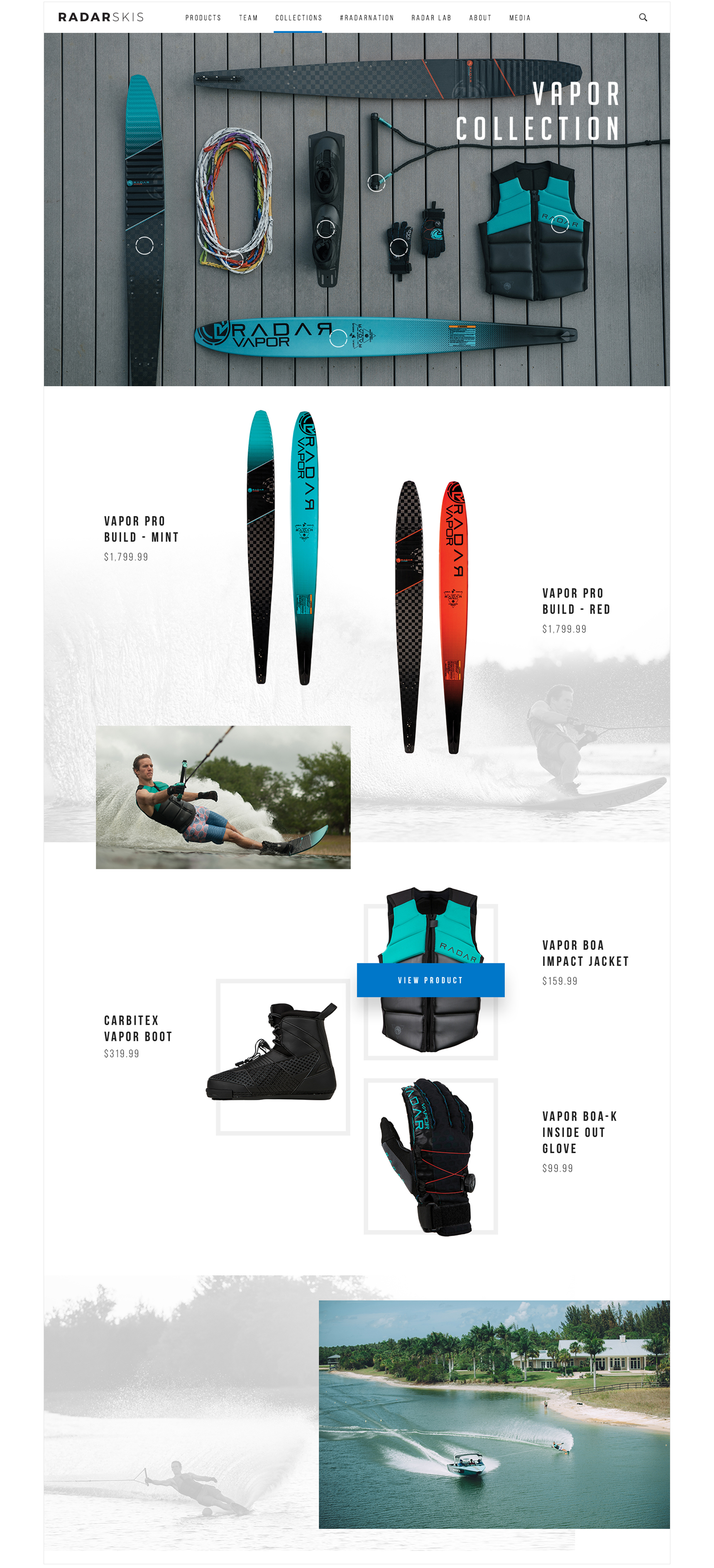
Discovering products through curated collections allows customers to explore and purchase a cohesive set of gear. To create a fluid shopping experience, I designed these pages with an approach similar to a look book. The overview page ties each collection with a sponsored athlete, while the description defines the collections theme.
ABOUT
Just go ski
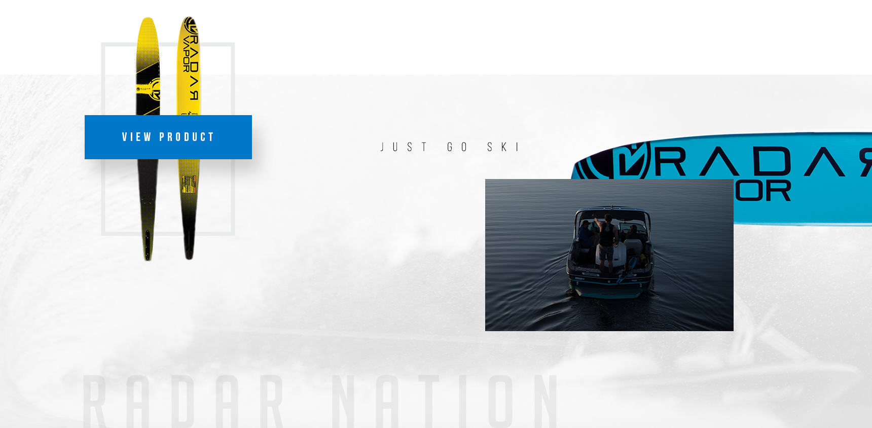
Featuring Radar’s team of athletes gives credibility to their dedication to the sport and product performance. Each profile includes a small bio and a collage of images of the athlete using the company’s products. The about and media page further utilize imagery in varying to lead the customer’s eye down the page. These pages serve to connect customers with the brand’s history of innovation and get involved with their current events.


An eCommerce site that disrupts typical female golf clothing
Skills
Visual Design
Interaction Design
Medium
eCom Website

KINONA
Providing brand awareness, while selling their new and upcoming clothing line.
Kinona is a women's golf clothing brand that originated from a dissatisfaction with boxy, unflattering golf clothing. The site needed to represent the unique nature of the clothing styles and be inclusive to new customers to create a community around the brand.
The first panel on the homepage served as a way to inform new customers about the shaping benefits of their clothes, while the content below highlighted the clothing line and company story. I provided photo direction including the masthead photo made to evoke a sense of freedom and also recommended lifestyle images on and off the golf course. I used a friendly, humanistic sans-serif typeface to fit the bold and confident brand voice. A dotted pattern was used throughout to speak to the shaping of the clothes.

ECOMMERCE
An authentic shopping experience
The overview page includes an alternate product photo on hover to feature a detail or different product view, while the detail page includes suggestions on outfit pairings.


CULTURE
Creating brand awareness and community around golfing
Kinona utilizes champions to spread their brand among their customers’ network. If customers want to become a champion, the main steps are clearly laid out with a call to action that puts those interested in contact with a Kinona representative. Their blog includes local trunk shows for potential customers and other golfing lifestyle and apparel tips.


Let’s
collaborate
LINKEDIN